An Image a Year in the Making: The Youth and the Future of Culture Logo
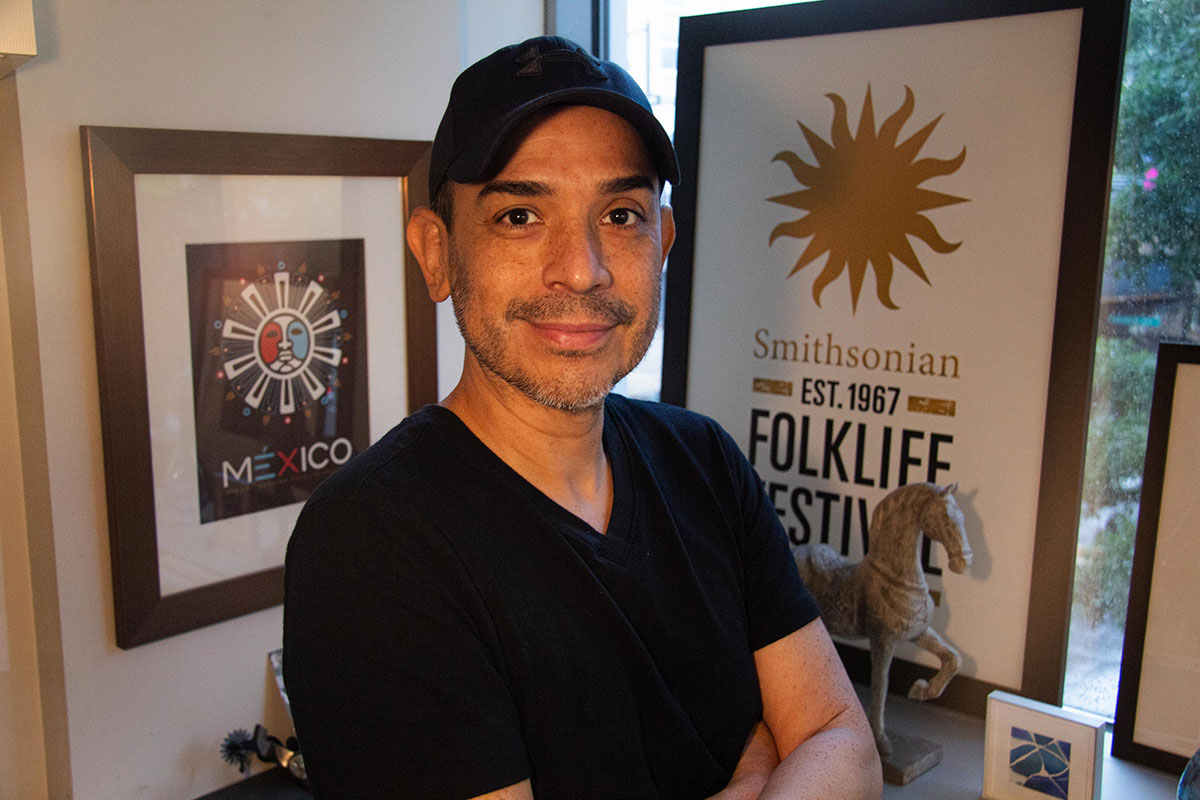
Josué Castilleja began working at the Center for Folklife and Cultural Heritage as senior designer in 2009 and became the art director in 2012.
Photo by Cassie Roshu
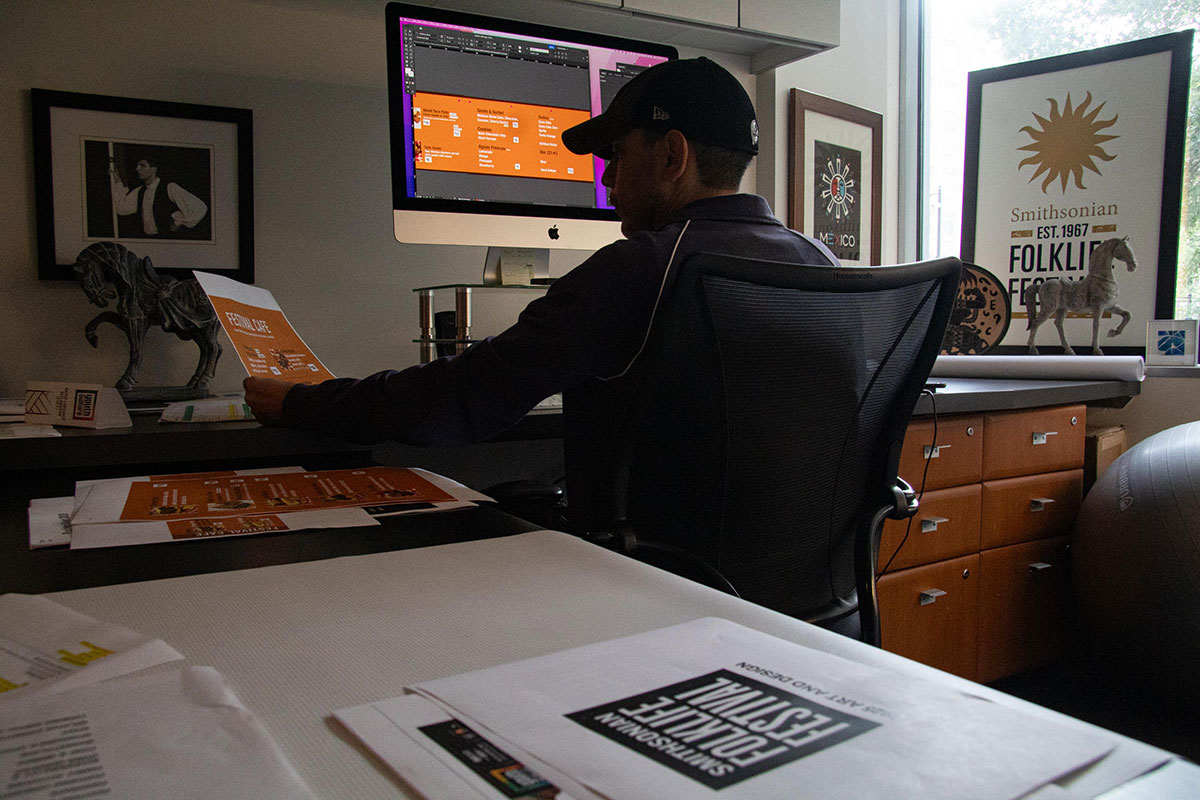
Creating a logo for an event like the Smithsonian Folklife Festival is a massive task, one that art director Josué Castilleja undertakes each fall, nearly a year in advance. This program logo, used across marketing, merchandise, and more, carries the daunting responsibility of attracting people to the Festival virtually and physically. Despite Castilleja’s busy schedule, he took the time to walk me through his design process and each component he spent countless hours perfecting.
His process starts with the program title. For this year: Youth and the Future of Culture.
“I had always pictured that phrase in black and white because it’s abstract, and it also just encompassed everything: all youth, all the different skill sets they might have,” Castilleja said of this year’s theme. “The statement of youth and the future of culture was always, in my mind, kind of like the campaign ‘Got Milk?’ or ‘Straight Out of Compton’—those straightforward phrases.”
This program logo was also an opportunity to experiment with size and letter case in a way others haven’t allowed.
“The lockup of the text itself with the word ‘youth’ being large and ‘culture’ being large [and lowercase] was purposefully done,” he continued. “Usually when we develop a logo for a country or a state name, it’s all capitals, and here was a chance to put lowercase.”
My favorite part of Castilleja’s final design? “At great distance, where we are on the National Mall, you see ‘youth’ [and] ‘culture,’” he told me. “Those two words pop out.”
The text is only one component, however, and we didn’t even brush on Castilleja’s typeface choice. Once the text was solidified, his attention turned to colors. At first, Castilleja and the program curators, who were involved in the design process, tried hot pink, then orange and magenta. They couldn’t agree on any one palette, Castilleja noted, since some seemed too feminine or masculine, while others felt too young or old.
Eventually, someone pointed out one of Castilleja’s samples on the wall, one of the first ideas that had come to him: a multicolored frame with the current text lockup boldly white in the center.
“I actually put that [idea] on the corner of the wall while we were discussing other samples that curators and the director wanted to see,” remembered Castilleja. “One curator looked over there and said, ‘How about that one?’ In the end, it really came to being a rainbow, a multicolored icon that felt youthful. It also felt celebratory. And it is in all cultures—the rainbow, the spectrum.”
That initial idea is very close to the final logo, but Castilleja wanted to emphasize the recurring theme of mentorship in this year’s Festival program.
“We don’t call [the border] a rainbow, and we don’t call it just colorful,” said Castilleja. “It’s specifically a color prism, a spectrum, and I also like mentioning that it comes from white light. You know what’s naturally found in white light? Variation. A spectrum is all the colors and their layers because with every youth that’s coming to show their skills, there’s a mentor there.”
In my two weeks here at the Center for Folklife and Cultural Heritage, I’ve noticed just how much Youth and the Future of Culture emphasizes the connection between children and their parents, teachers, and ancestors—mentors and those they teach.
Castilleja kept this connectivity in mind when selecting the color spectrum. For each of the eight program areas, he delved into the color palettes and found one or two colors that reminded him of the people and creative expressions represented. Castilleja chose each color in coordination with the program’s curator to, in his words, reinforce the idea that there’s a diversity of talent coming to, participating in, and coordinating this year’s events.
In the end, what makes this program logo so special, both to Castilleja and for the Festival, is that it’s one of the only logos to have had this much youth input. Normally, he designs logos more formally with directors and other officials, so to have young voices added to the mix is rare. In fact, the final color selection was due in large part to an intern.
“I was working with some interns in the Cooper Hewitt Museum in New York City, and so I would ask them about color palettes, what their thoughts were, and that’s where one of them said neon,” Castilleja explained. “That was interesting because, when all the older folks were in the room in the first meetings, nobody brought up neon. I thought of multiple colors; others thought of magenta and orange as a youthful color, but the term neon or, in general, all the colors didn’t. One intern, who was just out of high school, actually said it.”
Now, with a week left until the Festival, the completed and color-packed logo is getting printed on T-shirts, tote bags, signs, and more. Everyone in the Center is eager to get their hands on it, and we’re even more excited for the public to spot it throughout the National Mall.
“I’m glad that all generations like this logo because it definitely got quick, positive feedback from anyone that was young that saw it,” Castilleja said. “I’m glad that it turned out to be a colorful and inviting logo versus a serious one.”

Shauri Thacker is a Folklife Storyteller Workshop intern focusing on writing and editing. She graduated from Southern Utah University last year with her bachelor’s degree in English, creative writing emphasis.