Discover Immigration Trends with Social Explorer Maps
Editor’s note: Social Explorer is a company that provides access to current and historical census data and demographic information to let users create maps and reports to illustrate, analyze, and understand demography and social change. Social Explorer media editor Sydney Beveridge submitted this blog post to us, originally posted on their site.
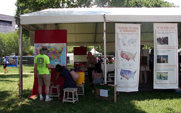
Social Explorer created custom data maps to tell the story of America’s immigrant heritage for the Smithsonian Folklife Festival On the Move: Migration and Immigration Today. Visit our banner display to trace immigrant journeys across the nation and through time.
Social Explorer, Inc. is a small business specializing in data visualization and information design. First conceived in 1999, Social Explorer breaks down the barriers to large-scale data analysis and demographic mapping. With support from the National Science Foundation and The New York Times, we developed a sophisticated data system and a simple online interface to engage users with current and historical demographic data. Our custom products, in addition to our popular subscription-based research tools on SocialExplorer.com, are used by millions of people around the world.
For this project, we combined detailed data analysis with our design expertise to create this series of maps. The historical immigration data come from the 1940 Complete Count Census as compiled and made available by the Minnesota Population Center, Integrated Public Use Micro-Data Samples. The recent data are from the 2010-2014 American Community Survey of the U.S. Census Bureau.
We start our journey with a map of the foreign born population in 1940 that highlights earlier waves of immigration across the United States. Back then, 8.3 percent of the population was born abroad, or more than one in 12 people.

Today, 13.1 percent the U.S. population was born abroad, which means that more than one in eight Americans are immigrants. The next map shows how the foreign-born population is distributed across the United States all the way down to the county level. Explore the map to see where immigrants are concentrated and which origins are common in different parts of the country.
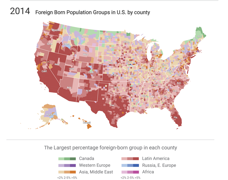
Learn about the foreign born population in your own hometown with SocialExplorer.com’s interactive map. Zoom in for more detail, and click through the menus to explore by different ancestry groups.
Visit our banner and the rest of the Smithsonian Folklife Festival from through July 4 and July 7 through 10.
Find out more about Social Explorer at our website.
We are delighted to collaborate with the Smithsonian on this project. Other partners include Pearson Education Publishing, the U.S. Census Bureau, the Women’s Foundation of Minnesota and the Ellis Island Museum. Our honors include a Webby Award, two Webby Honorees, a Modern Library Awards Gold Medal, and a Reference and User Services Association (a division of the American Library Association) Outstanding Reference Source Award.