Behind the Scenes: Designing the Perú: Pachamama Logo
If you have visited the Folklife Festival or seen our promotional posters around the area, you have probably noticed the swirling logo for the Perú: Pachamama program. Much time and research went into its design, so the “icon” could thoughtfully and equally represent the twelve artisan groups we brought from Peru to the National Mall. In an earlier interview, Festival art director Josué Castilleja shared his general design process. Here, he explains the designs for the Peru program.
How did you begin designing the icon?
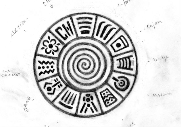
We started working on the icon in the fall of 2014 when we finalized the name of the program as Perú: Pachamama. The first thing I designed was the lettering. In the word “Perú,” the letters are broken up to represent building blocks coming together, reflecting the overall theme of the program and of the icon: connectivity. “Pachamama” means Mother Earth and is also represented by the spiral in the center of the icon. The spiral moves inward, to symbolize how the participants from the twelve groups are coming together on the National Mall. The spiral is also, however, moving back out. This represents culture and people going out into the world and includes communities of Peruvians living in the United States.
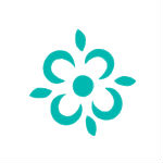
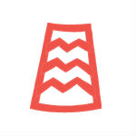
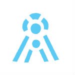
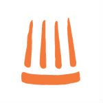
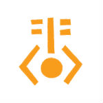
What is the meaning behind each of the twelve symbols around the outside of the circle?
Each symbol represents a different one of the twelve artisan groups featured at the Festival. They are hand drawn to reflect the style of pre-Hispanic iconography and writing. Their design is modern but is still connected to Peru’s history, representing each of the case studies equally in a unifying way.
Click on each icon to learn more:


How did your designs change throughout the process?
I started sketching after reading about each of the artisan groups. When I traveled to Peru, I shared the designs with the participants and made some changes once we finalized who would actually be coming to the Festival.
What is your favorite thing about the icon?
The icon is meant to be viewed from a distance at first, with the lettering as the main component. The whole icon is colorful, family-friendly, and fun, but visitors may not notice its layers of meaning at first. As visitors spend time with the participants they can learn about what all of the symbols mean and gain a better understanding of how they’re connected. The goal is for visitors and participants to take the icon with them on the T-shirts or the Festival guide as a reminder of the people they meet and the things they learn.
Georgia “Ellie” Dassler is a media intern at the Center for Folklife and Cultural Heritage and a student at the College of William & Mary, where she studies anthropology and teaching English to speakers of other languages.